
“Steve”, Children’s Book Illustrations
Here is the story of my first adventure in Children’s Book Illustration. The story was written by the immensely talents Katherine Ringley. Included below are character studies and layouts, as well as my process walkthroughs.
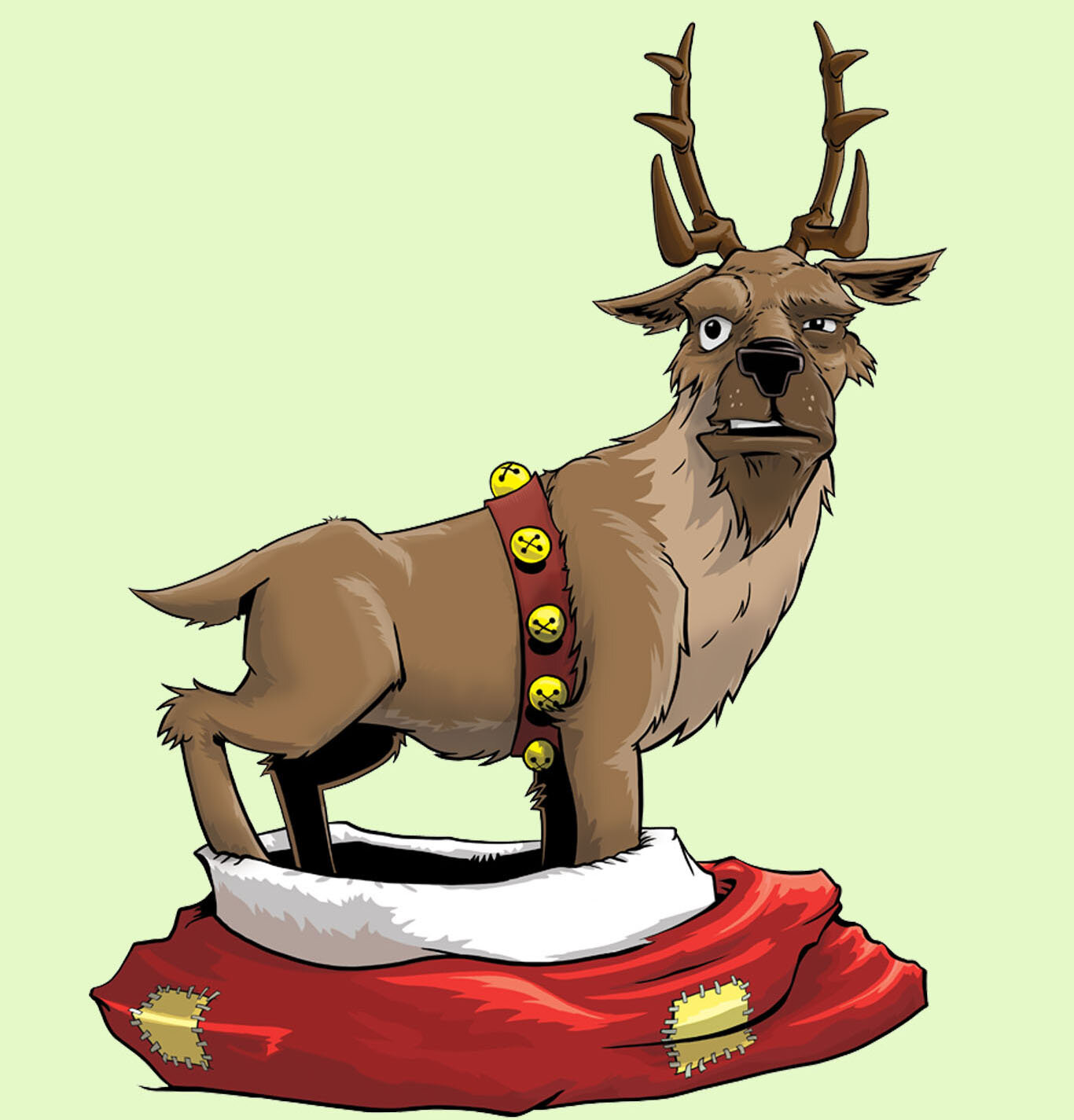
Character Layouts, Line work, and Environments.
Here are the layouts for a few of the main characters I moved forward with, along with examples of finished linework and environmental elements.
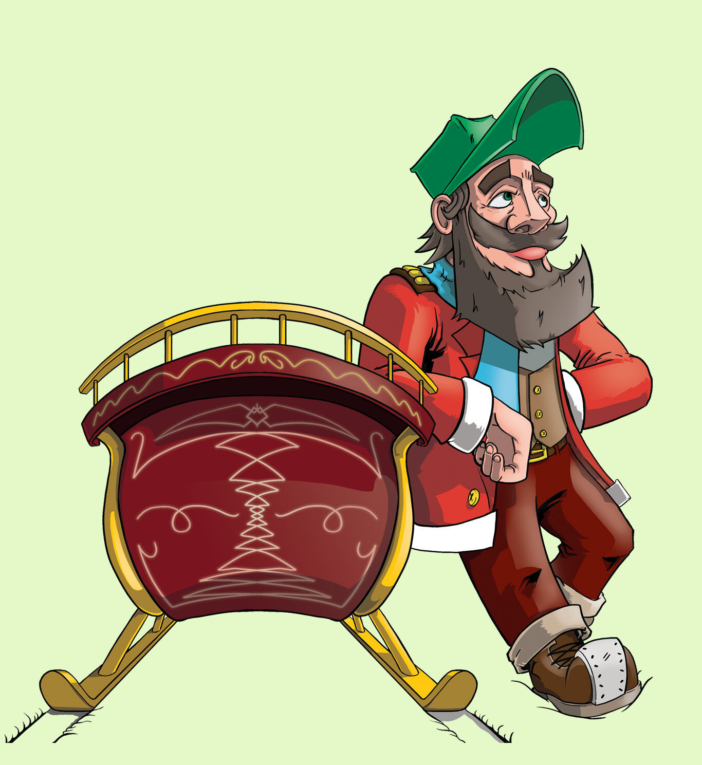
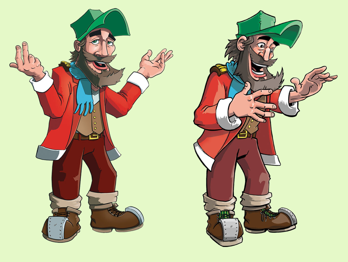

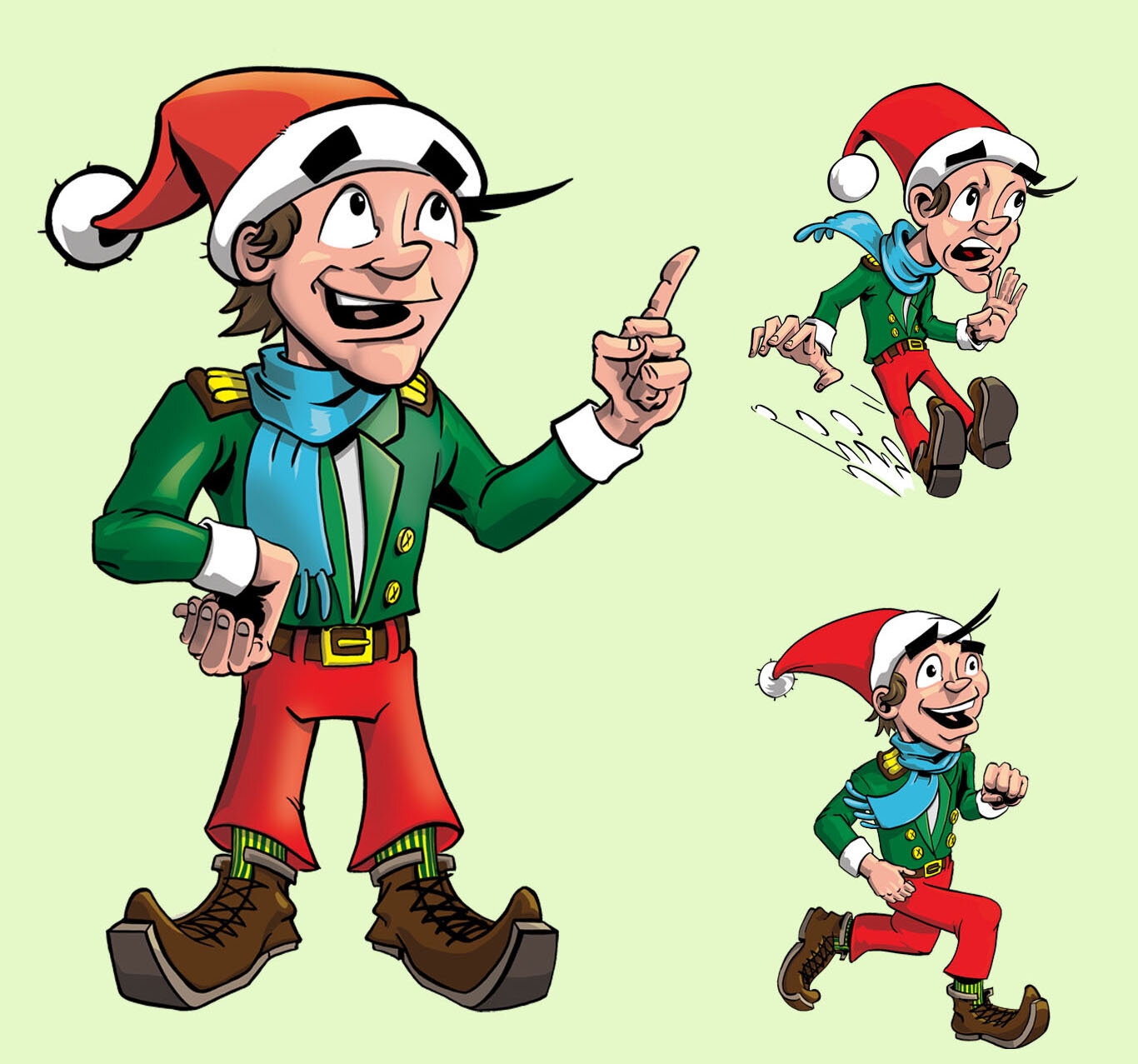


Character Studies

Watercolor, and Photoshop character study.

Pen and Ink on grey toned paper, character study. Santa.

Pen and Ink character study for showing variation in the thought process and stylistic approach. Santa.

Pen and Ink Character study to show facial expression. Unused Character.
Page Layout Examples
These are some examples of how my process comes together for each individual page. I begin my process with simple thumbnails sketches to achieve the idea for the page and then refine the images to solid line work. These steps are the basis for everything, during this I try to keep in mind proportion, and compositional elements such as the rule of third and golden spiral. I then insert my flats from my predetermined color palette, where I render out my shadows and highlights to achieve a polished look. Book Illustrations are all about process to me. One step leads to the next, creating a linking system as to not forget the details and to make everything feel cohesive.
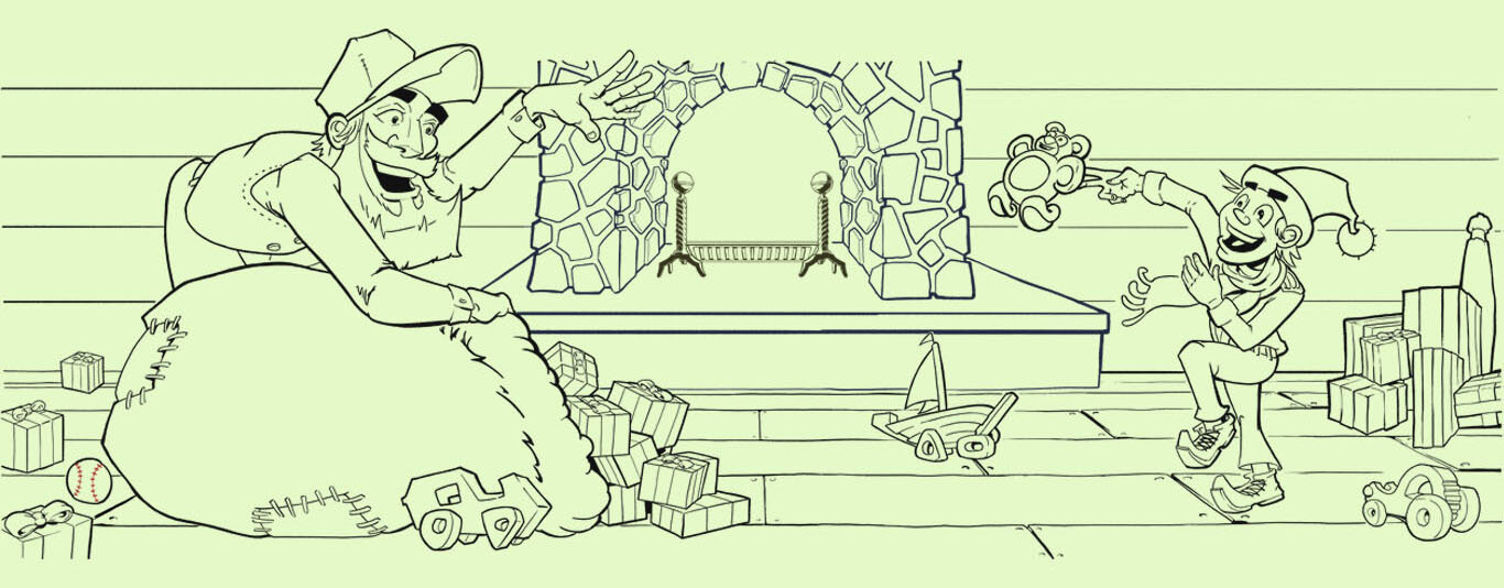
Page 2 Layout
This page was an establishing shot, showing the main character hard at work. I wanted the image to created a sense of depth, while still making it feel like it’s a small operation of making toys. The finished illustration includes a sub-panel to show him calling out to son. I used the sub-panels in numerous illustrations in the book to separate details from the written story and to create more of a sense of commentary that wasn’t distracting.
Thumbnail
This is a basic environment to introduce the character and establish the feel of the room.

Rough Sketching
In this image I was feeling out the layout a bit more with the introduction of the sub-panel. At this point I was still feeling out the characters clothes and how to incorporate the sub-panels into a main illustration.

Refined Linework w/ Color Palette Example.
After cleaning up my initial rough sketch, I placed Santa in his chair, addressed his clothing, established my main idea for the background, and how I wanted to incorporate the sub-panel. Then, I started to create my palette, I wanted the eye to be directed around the page from top left to bottom right. My approach was to utilizing bright contrasting colors surrounded by more muted tones.

Color Comp.
In the finalized panel I used the color palette I had established to fill in my flats and rendered out the page. I did play around more with characters size and added a few elements to make the scene feel a bit more lived in. Overall I was pretty happy with how this one turned out.
Page 13 Layout
Here are some process phots from page 13. It shows two brothers riding a donkey. My goal in creating these two characters was to have a contrast to the sisters that Santa and Alf had just passed by using a more rigid approach to the characters bodies and more saturated primary colors.

Thumbnail
This image is to introduce two brothers riding a mule the main characters meet on their travels. Two judgement men who can’t afford their own ride.

Rough Sketching
Using the thumbnail sketch. I fleshed out sizing and position of the characters and how I wanted break the panel with the animal head.

Refining Line work.
To refine the rough sketch, I used some animal references, and cleaned up the anatomical issues, while keeping in mind my line weight. Compositionally, I wanted the eye to move around the image as if they were looking around an upside triangle. Top left, to top right to bottom middle and back up to the left again. The taller brothers hand matches fairly closely to that of a well known figure on the ceiling of the Sistine Chapel. Though out the book I included some other elements from classical art such as this and also some sign language.
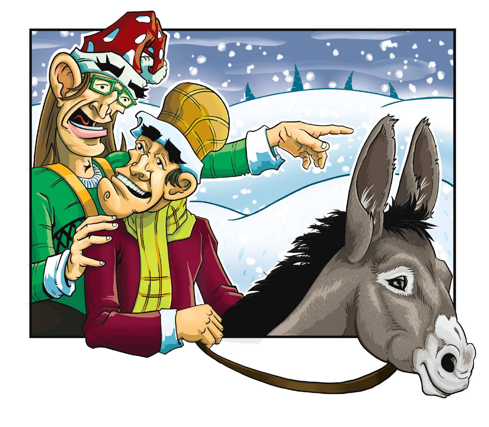
Final Layout
After cleaning up the line work and making some final color adjustments. I adjusted the border and how the characters break the box, making them feel like they’re coming out of the page. In this, the final version of the illustration, the background imagery fits in with the rest of the exterior images in the book as I incorporated a color change across the sky in all of the exterior shots to show the progression of time. I wanted it to appear to be night by the end of the book. Early page in the book the sky is more of a baby blue, and by the end its a deeper, darker, purple.
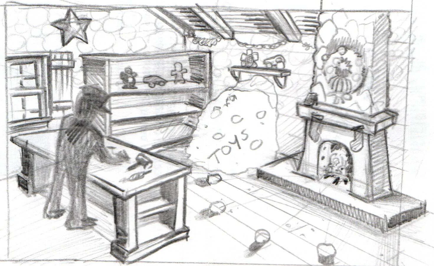
Page 22 Layout
Adding in some process photos as I create the page layouts. Starting out through thumb nailing and story boarding as I’m planning my way through the main storyline. In this frame a new character is introduced w/ an animal character laying on its back in some sort of distress.

Thumbnail Sketch
This page introduces a the Shop Keeper. A diminutive man with a large sales presence. His purpose is to sell the main characters a means of transportation.

Cleaning up the linework.
Using the thumbnail sketch. I started cleaning up the line work. I wanted the focus to be on main characters, so I kept the middle and back ground lighter in detail to help establish that focus.
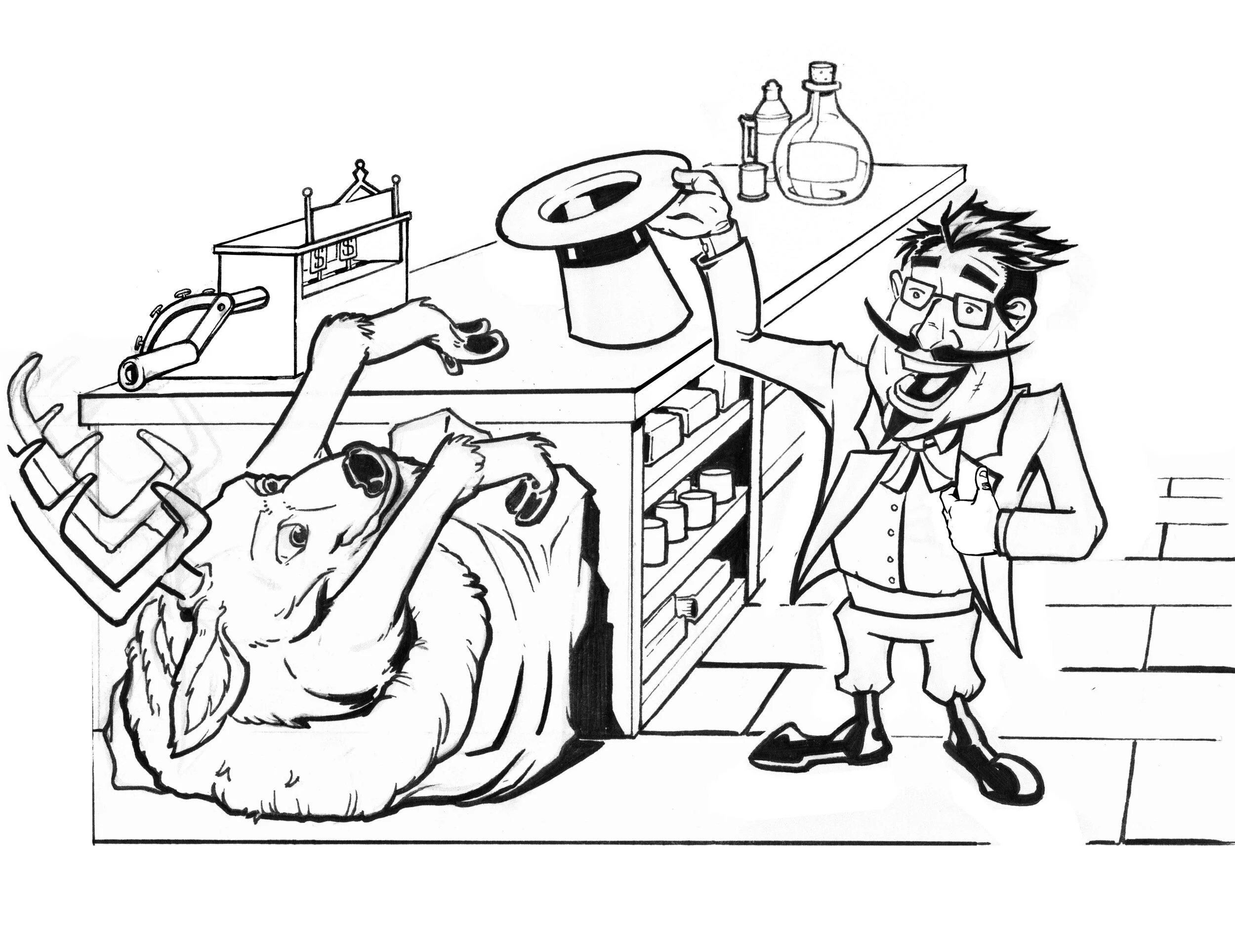
Character adjustment
Going back through I realize I had drawn the Shop Keeper a little too tall. I also incorporated other elements that tie into other panels. Like the cash register, and included some countertop elements for ambience.
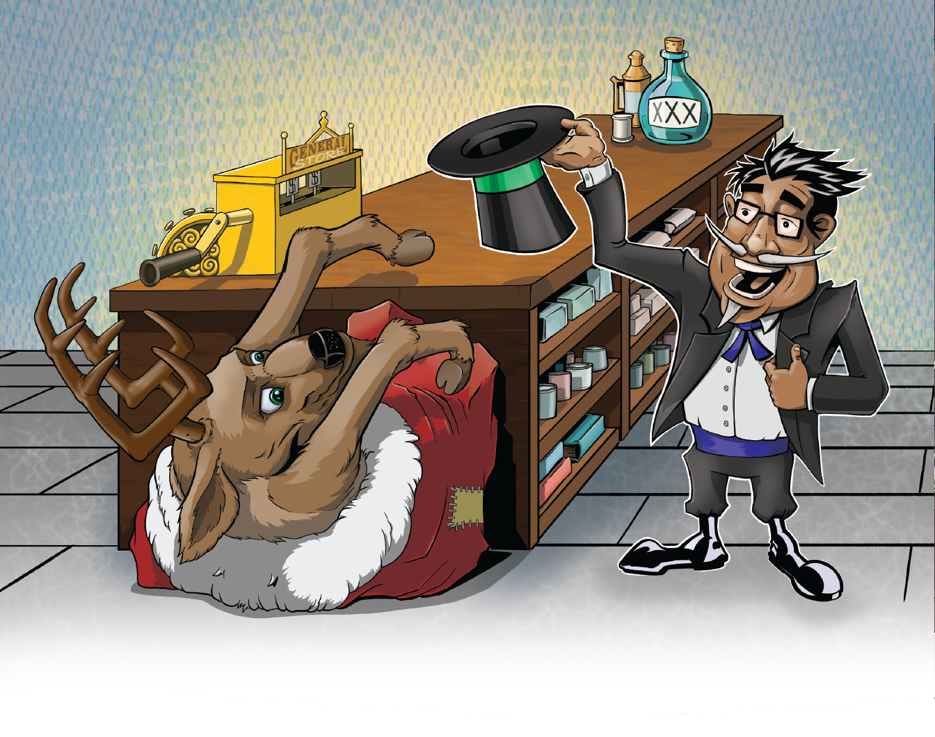
Final Layout
As I finalized the layout and began to incorporate more environmental detail, I decided to keep the composition a bit more simple. The proceeding pages had more detail and a wider field of view and I didn’t want it to be too overwhelming. I feel like the image was successful in introducing the character.
To view the completed project feel free to contact me @ DanielPaul804@gmail.com