Mellow Mushroom-Williamsburg, VA
This restaurant holds a special place in my heart. When I was a freshman in college there were only a few locations. One was in Savannah, where I went to college, and it was awesome. It was a small-time operation, before any of the corporate identity that exists today, it was a hole in the wall that just served good food and had a ridiculously fun trivia night. When I was given the chance to create something for this company, I leapt at the chance. A new location was opening up in Williamsburg, VA and they needed something unique on the front of their store. On a corporate level, almost every store seems like it’s something new, designed with a general theme surrounding a big yellow mushroom man (Mell O. Mushroom) employing hypnotic, retro imagery on every wall. This location, however, was opening in a historically protected area. That means everything about the wild style Mellow Mushroom is known for had to be tamped down on the outside to fit the historic aesthetic of Colonial Williamsburg. Here is the story of designs I produced, and the finished product.
A first pass at nostalgia.
In my first attempt at designing an entirely new concept, I shot for the moon. I wanted to use all the primary colors from their branding examples, a lot of flowing lines and flourish, and even threw in a peace sign for good measure. In my mind, I wanted to bring my memories of college in that Savannah location back to life. The client loved it. The City of Williamsburg, and their Historic Preservation Society did not. The colors weren’t a part of their approved Historic District Zoning color list, and the “loudness” of the design was not on brand for the city. This design, unfortunately, was just too flashy to live, so it was back to drawing board.
Feedback and Compromise
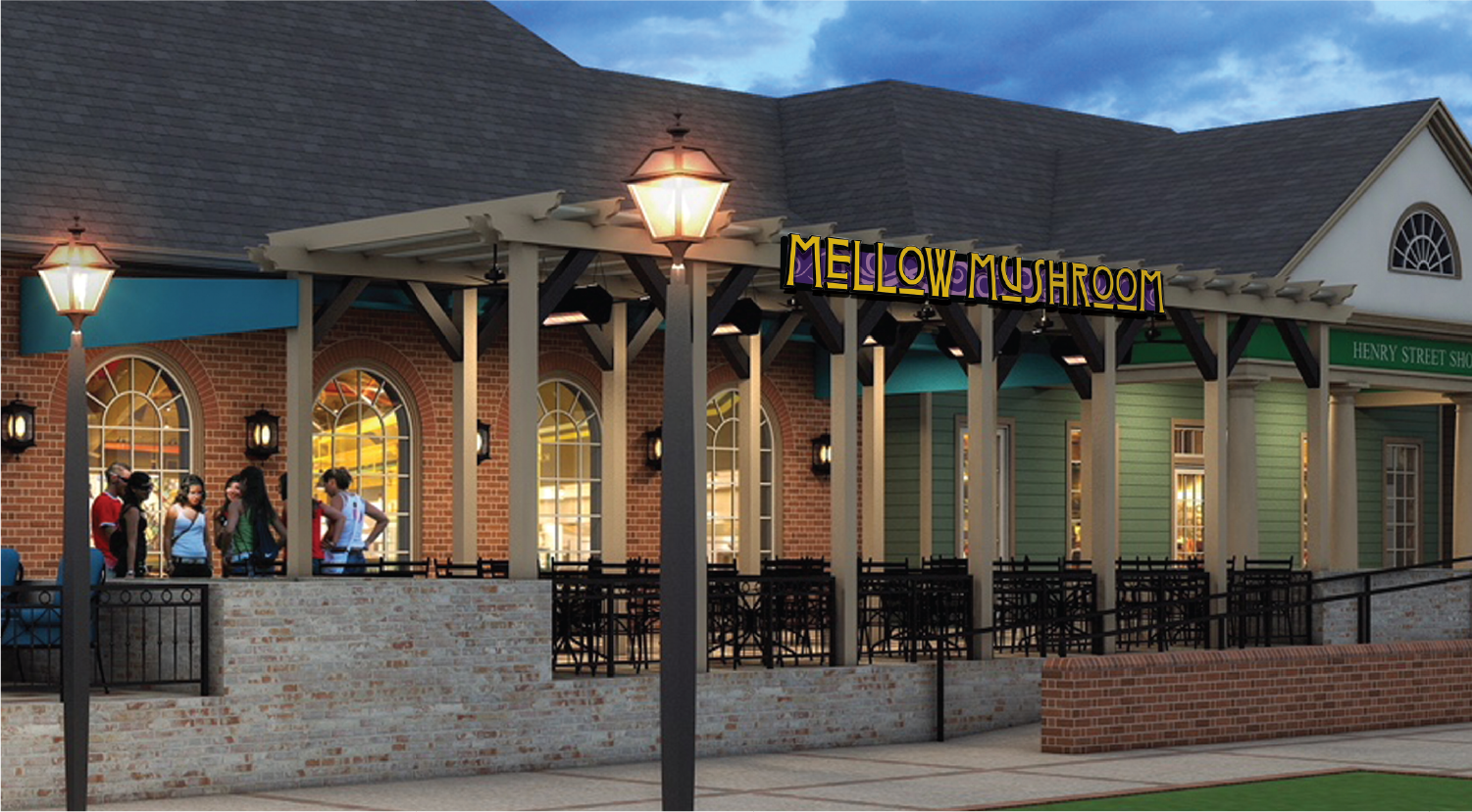
Skipping forward several months, and several different iterations. This format was approved by both Mellow Mushroom and the many review boards of Williamsburg. A Gothic inspired font, combined with an American Horror Story vibe, the search for something edgy yet fitting had seemingly paid off. The design consisted of gold copy, a purple two-tone decorative background encompassed within a black frame. This layout was nearly on its way to being approved. Until the city called and wanted to discuss one last thing.
Where the rubber meets the road.
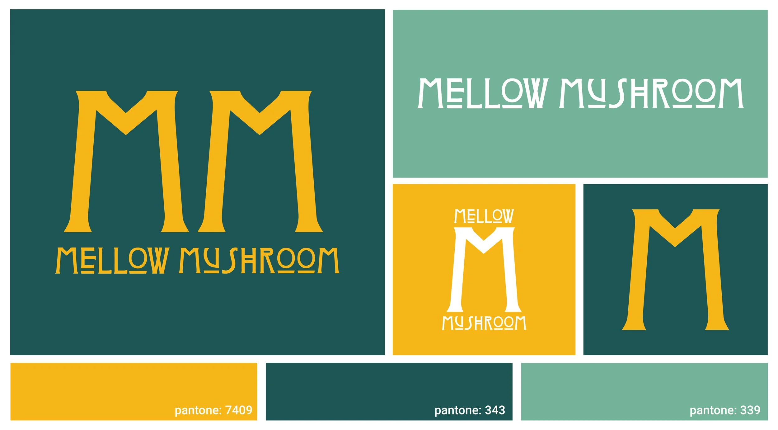
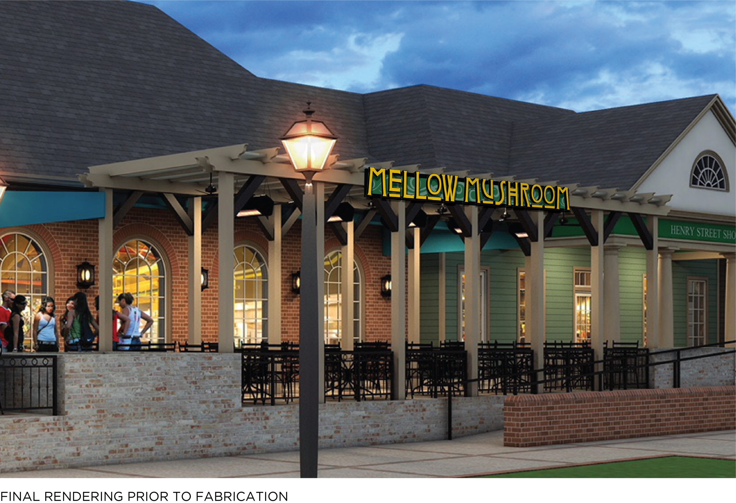
The key to picking colors when it concerns a review board, is to keep it simple, and to keep it local. After talking to the city and the client, it was agreed that it would be in everyone’s best interest to use the colors of the local college, William and Mary. I reached out to the college and acquired their branding guidelines, and this is how I ended up with the color scheme. Now that the layout was approved, I created a design package for fabrication and assembly to make this design as dimensional as possible. On the right, is the diagram I created to show how a 20’ wide fabricated aluminum piece of wall art was to be fabricated and assembled, with the newly chosen Pantone colors choices.
Rendering and Install
After weeks of collaborating with the client, the City of Williamsburg, permitting offices, historic preservation societies, and my sales and fabrication team, here is the final product. I couldn’t be happier with how it turned out. Looking back, the challenges of this project just made for a better product in the end. A design with motion, and dimension that really stands out without compromising the wild and imaginative theme that Mellow Mushroom pulls off in every location.


